Updater utilities enrollment flow
Updater’s mission is to make moving a more enjoyable experience. They do so by consolidating all your critical moving needs into one area and customize it to your needs based on their incredibly powerful data platform and partner integrations. Think forwarding your mail, signing up for renters insurance, and setting up your TV/Internet experience.
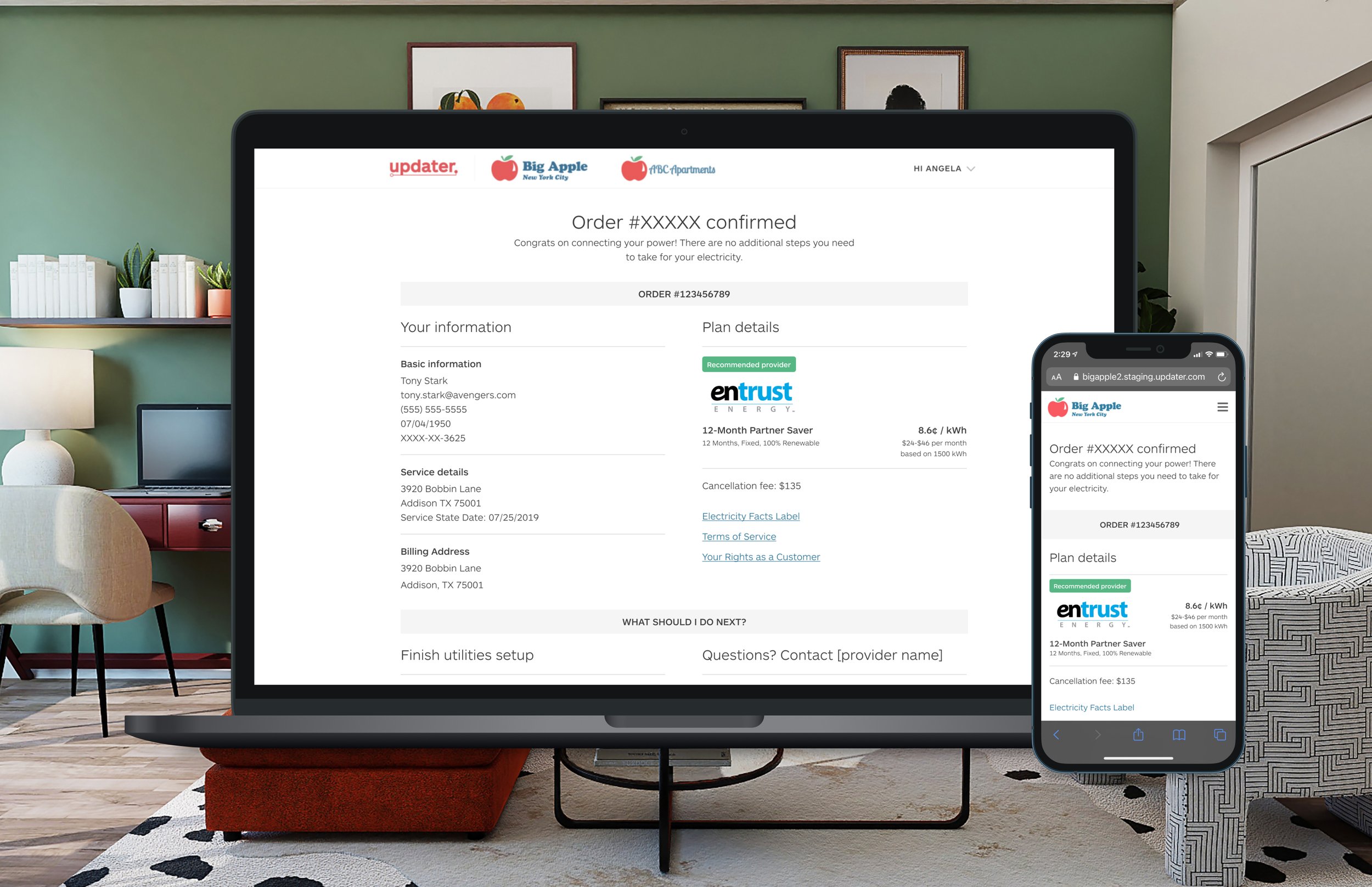
Tl;dr: I designed an online shopping and enrollment flow for users to get their electricity hooked up.
In order to comply with my non-disclosure agreement, I have not included any proprietary information or precise research data in this case study.
The team and timeline
TEAM
One product manager, one product designer (me), and 2 front end engineers, and 2 back end engineers
TIMELINE
3 weeks
My Responsibilities
Ideation
Research: I conducted market research to better understand how a user signs up for electrical service across the country.
Scope and Deployment Strategy: Updater had just inked a partnership with WattBuy, a 3rd party platform whose mission is to give consumers the information needed to make informed decisions about their electricity provider. The company wanted to get an electrical service signup up and running as quickly as possible, and I worked with the overall team to help define the MVP feature set for launch.
Iteration
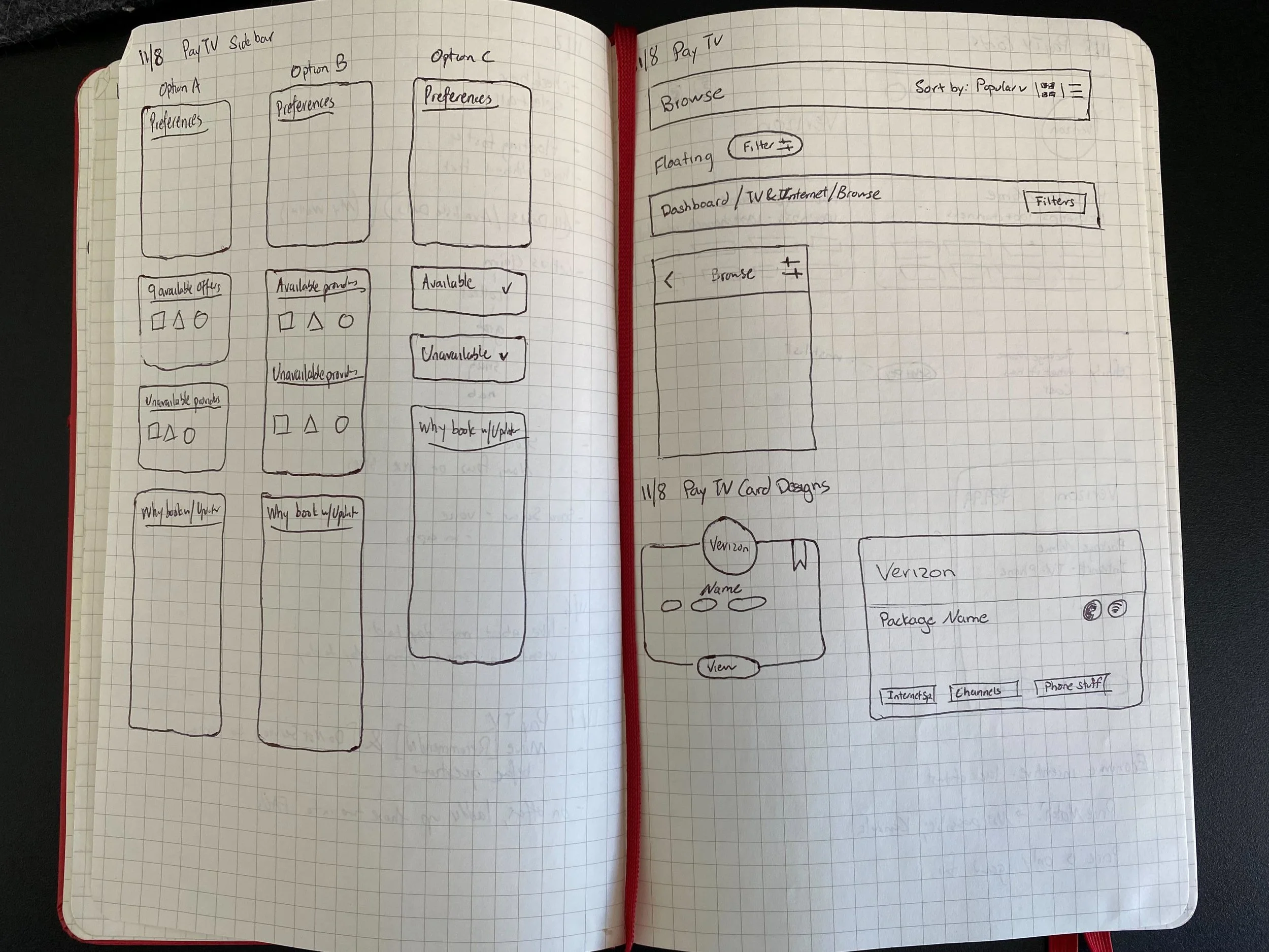
Design: I crafted the workflows, the wireframes, and the ultimate design. I user tested with multiple cross functional Updater employees as well as user testers to pressure test the experience before launch.
Feedback: I collaborated with my product and engineering teams to ensure that we remained on schedule with our tight timeline. I led discussions to force prioritize what was necessary for launch and what would be considered a fast-follow.
Implementation
Learn through launch: We launched in Q4 2019 and obsessively tracked our quantitative metrics through Optimizely and our qualitative metrics through Fullstory.
The Challenge
Problem space
When it comes to hooking up your utilities, historically you’ve had to call or go through antiquated online sign up flows built by utility companies. For many people around the country, they only have access to one electrical service provider. But for certain geographies, the market is deregulated, which gives the user the opportunity to select their own provider and set up service. This requires the user to find all the available providers in their area and then sign up directly through them. Through qualitative research, I found that users felt overwhelmed when sifting through all available utility providers. I also found that users didn’t understand how electrical service was supplied and charged, didn’t know about contract length differences, and saw the providers themselves as essentially clones of one another.
Updater opportunity
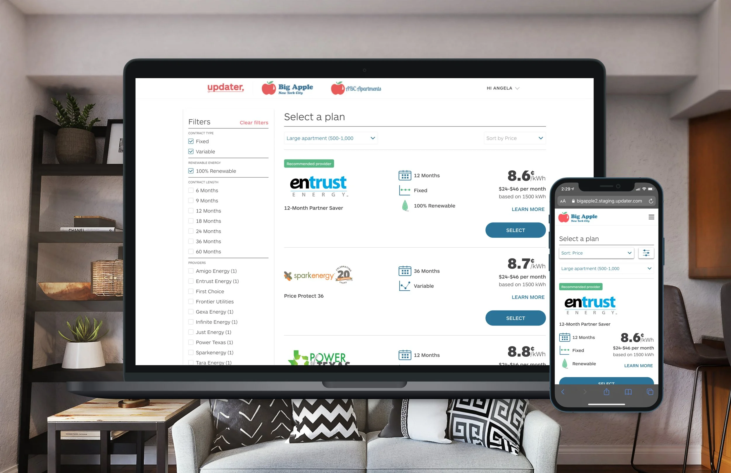
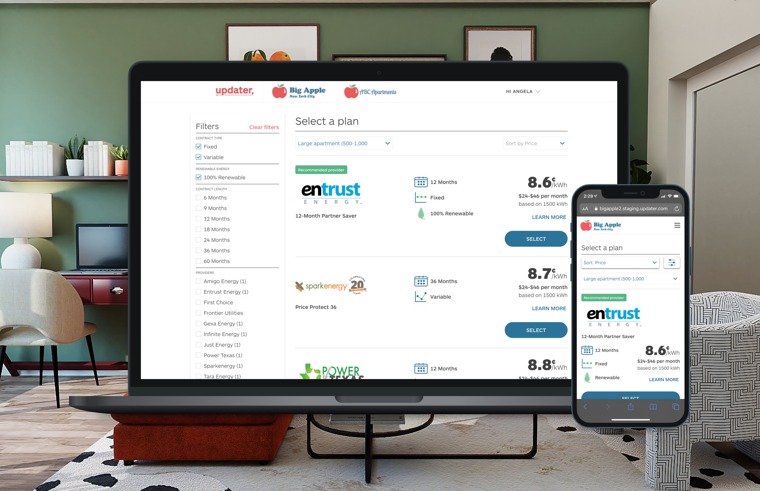
What Updater provided was a consolidation of all the providers’ and their rates in one space, and allowed the user to sign up in one space. Updater’s integration with WattBuy allowed us to finally connect the user with the provider, to allow for provider selection and plan enrollment to happen seamlessly. With this integration finally available, our two main objectives were
1. Provide a stable check out shopping and enrollment experience to process user signups
2. Set a baseline enrollment experience to iterate upon
The vision
Early on, it was clear that WattBuy’s early API version would limit what I could do. With little time, I had to create a shopping experience and signup flow that would become a baseline experience. After launch, we would focus on the results and iterate and ship fast-follow improvements.
The hypothesis
Based on the research and other feature testing we did, I set out to track one main hypothesis:
Hypothesis 1: Users care about price per kilowatt/hour (kWh) above all other factors
I had gotten signal that users saw their utility service as a purely economic decision. I set out to prove that by increasing the users’ focus on the price, but keep other important decision factors close for the user to enjoy a fully contextual view.
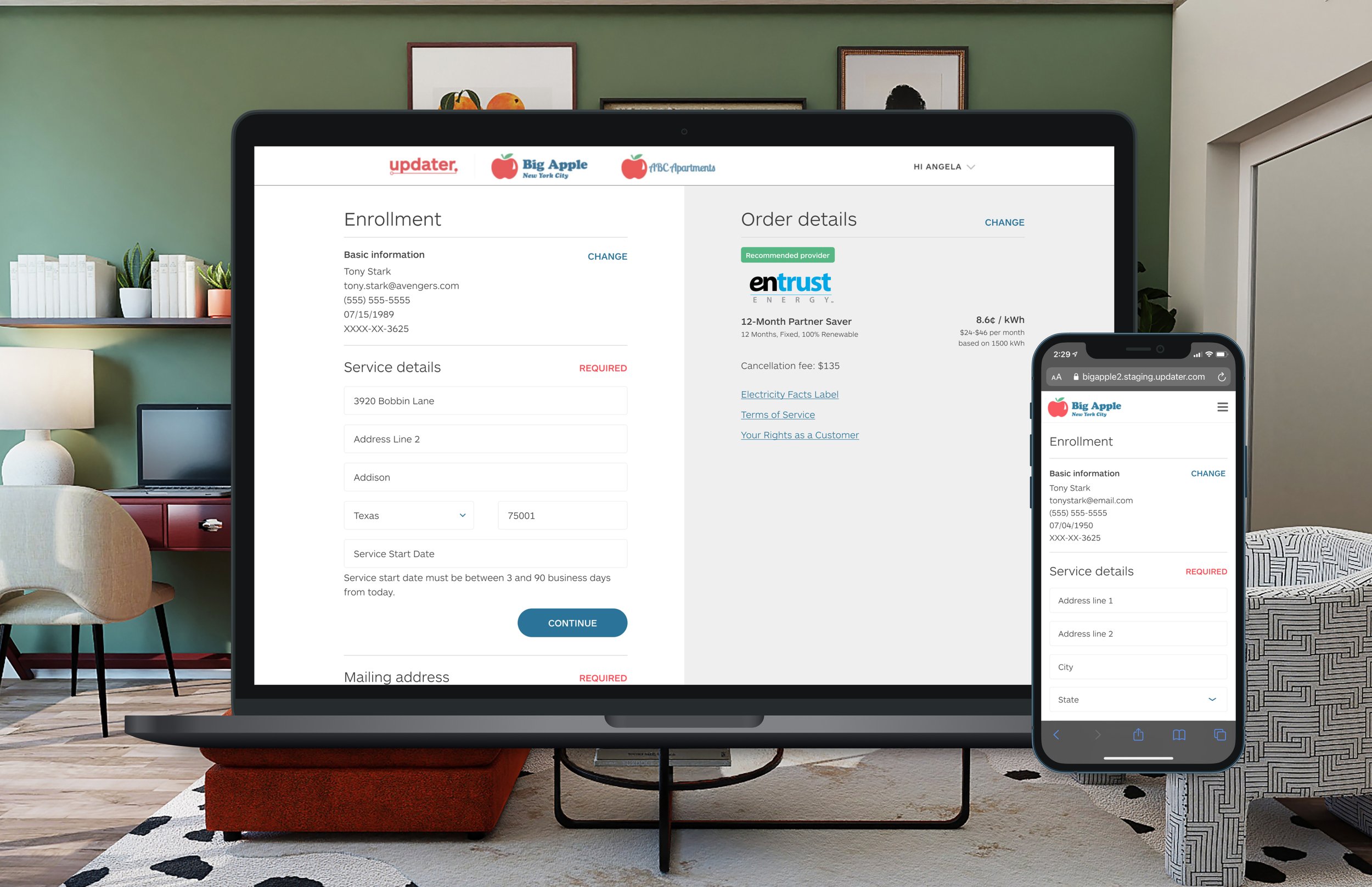
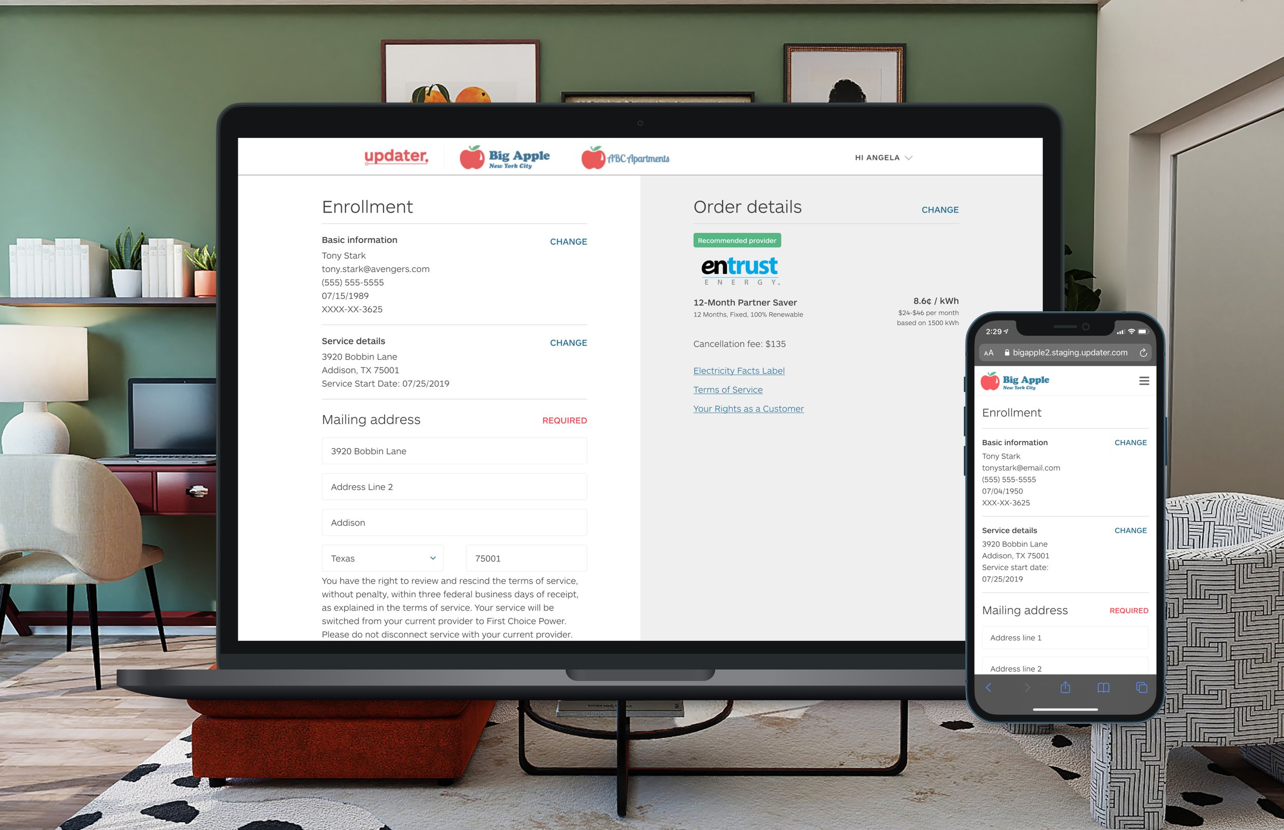
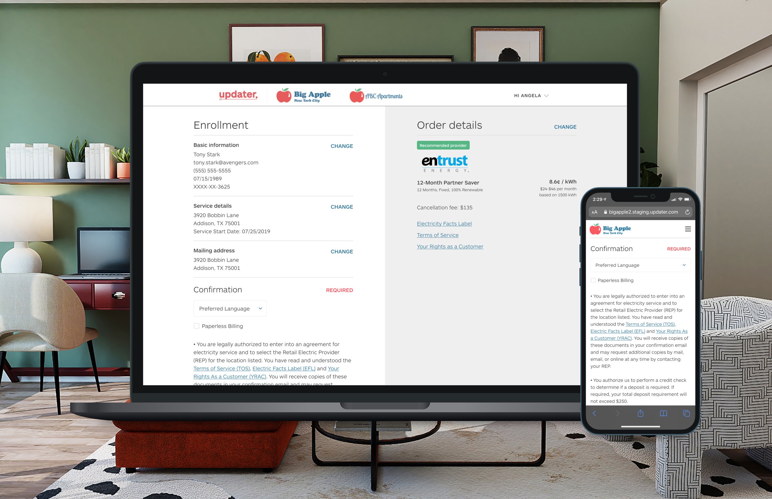
The final design
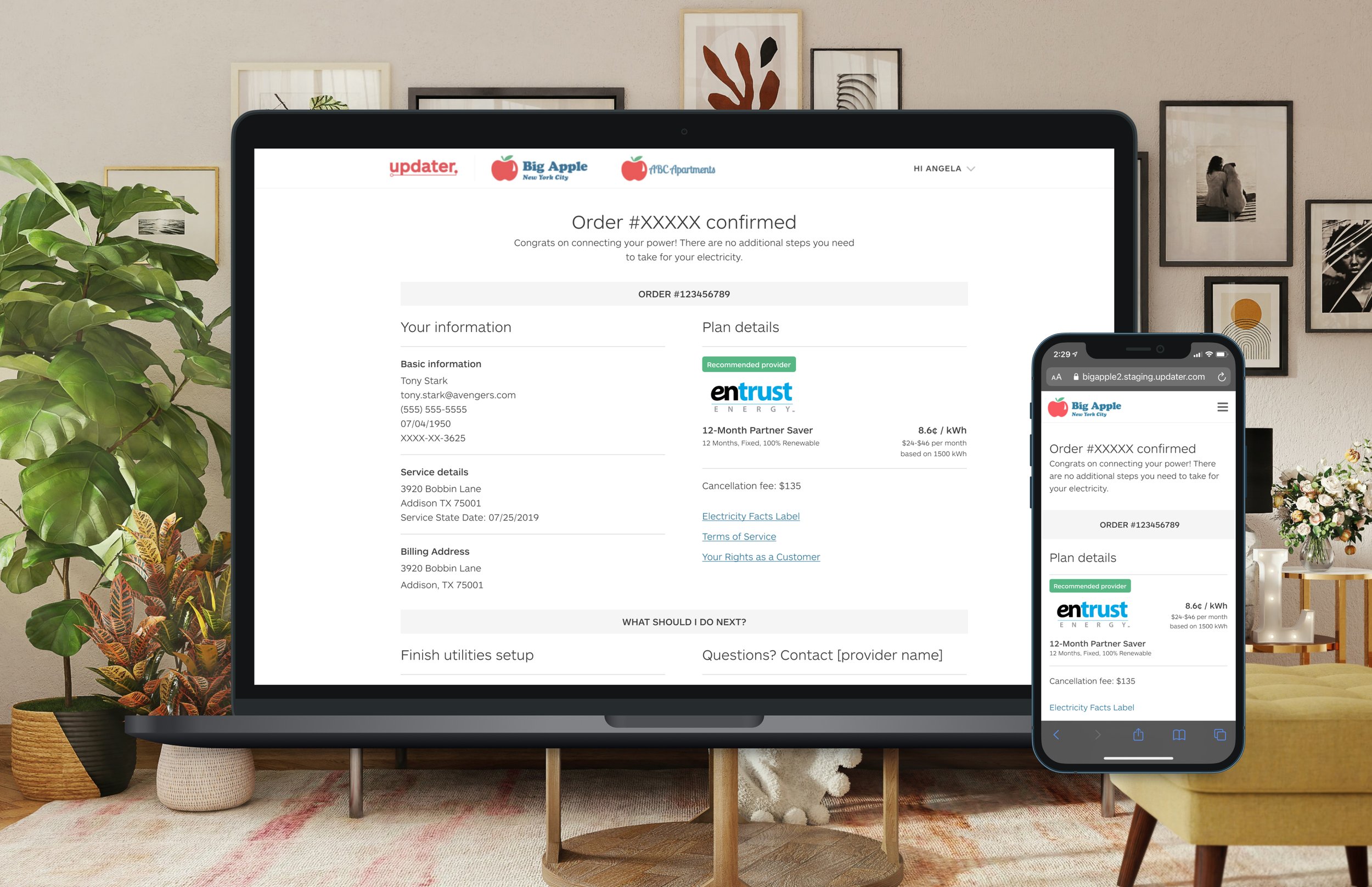
In order to keep things consistent across the Updater experience, I leveraged existing patterns for our shop and enrollment experiences. This continuity reduced the cognitive load when going through different experiences on Updater’s platform. We also mimicked standard utility sign up practices, and pre-filled as many form fields as possible to make the process feel smart, fast, and easy.
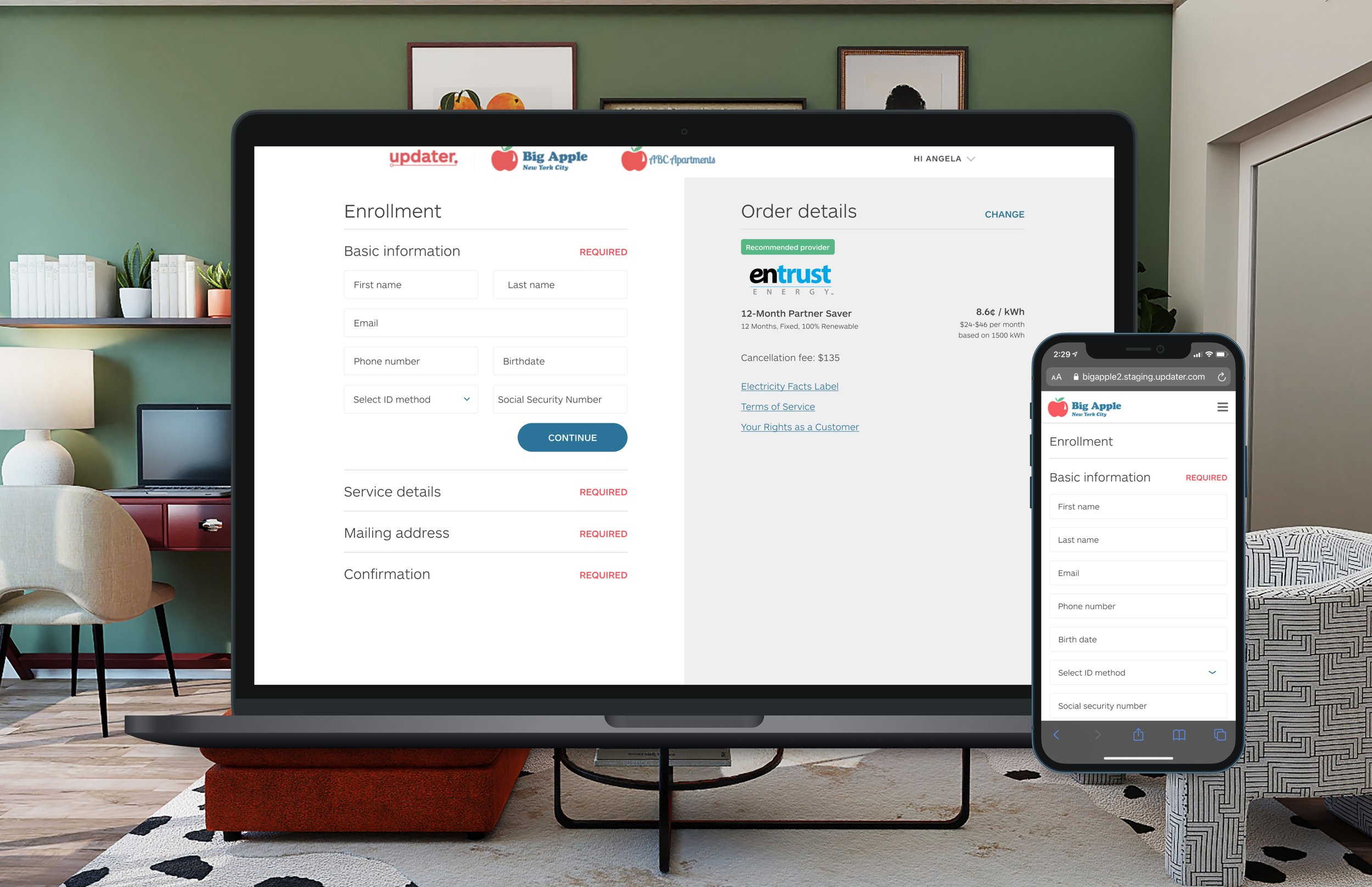
The results
After launching this in the state of Texas as our first deregulated market, we found immensely positive results. We saw close to 40% engagement with the product, and around a ~7% order submission rate.
In addition to the fantastic baseline results, I got strong signals about my hypothesis:
Hypothesis 1: Users care about price per kilowatt/hour (kWh) above all other factors
In qualitative studies, I confirmed that users were mostly concerned about price. Moreover, price variability played a key factor, with most users wanting fixed rates over variable rates. A catastrophic snowstorm in Texas had shifted user sentiment away from a pure price play to a fixed price play alongside existing price sensitivities.
The takeaways
Our Texas users saw immense value in being able to easily shop and sign up for their utility service in one space. Qualitative studies would later show that they enjoyed seeing all the available providers in one space for them to quickly analyze and compare before selecting an option to enroll in. Moreover, the enrollment process felt easy to understand given both the pre filled options and simple question prompts.
Fast follows for this included directing the team at WattBuy what to include in their API to make enrollment even easier. We also worked with them to improve the data we could show on the shopping page to increase the add to cart rate.