Updater online tv/internet purchase flow
Updater’s mission is to make moving a more enjoyable experience. They do so by consolidating all your critical moving needs into one area and customize it to your needs based on their incredibly powerful data platform and partner integrations. Think forwarding your mail, signing up for renters insurance, and setting up your TV/Internet experience. Historically, you could only buy TV/Internet service directly through the provider website or through theirs or 3rd party call centers. I aimed to digitize the online purchase experience by leveraging our provider partners’ APIs. This had never been done before.
Tl;dr: I designed an online purchasing flow for a critical revenue driving experience which resulted in 50%+ lift in revenue compared to our legacy purchasing experiences.
In order to comply with my non-disclosure agreement, I have not included any proprietary information or precise research data in this case study.
My Responsibilities
I was the lead product designer working with one product manager and 4 front end engineers. The product was designed as a responsive web app.
Ideation
Research: I conducted market research to crystallize our feature set. I also had been the lead product designer on two years worth of feature testing prior to this project in the TV/Internet space so I was a subject matter expert in purchasing TV/Internet.
Scope and Deployment Strategy: I worked with the overall team to help define the MVP feature set for launch. This included gaining an intimate understanding of the API documentation to see what could be supported.
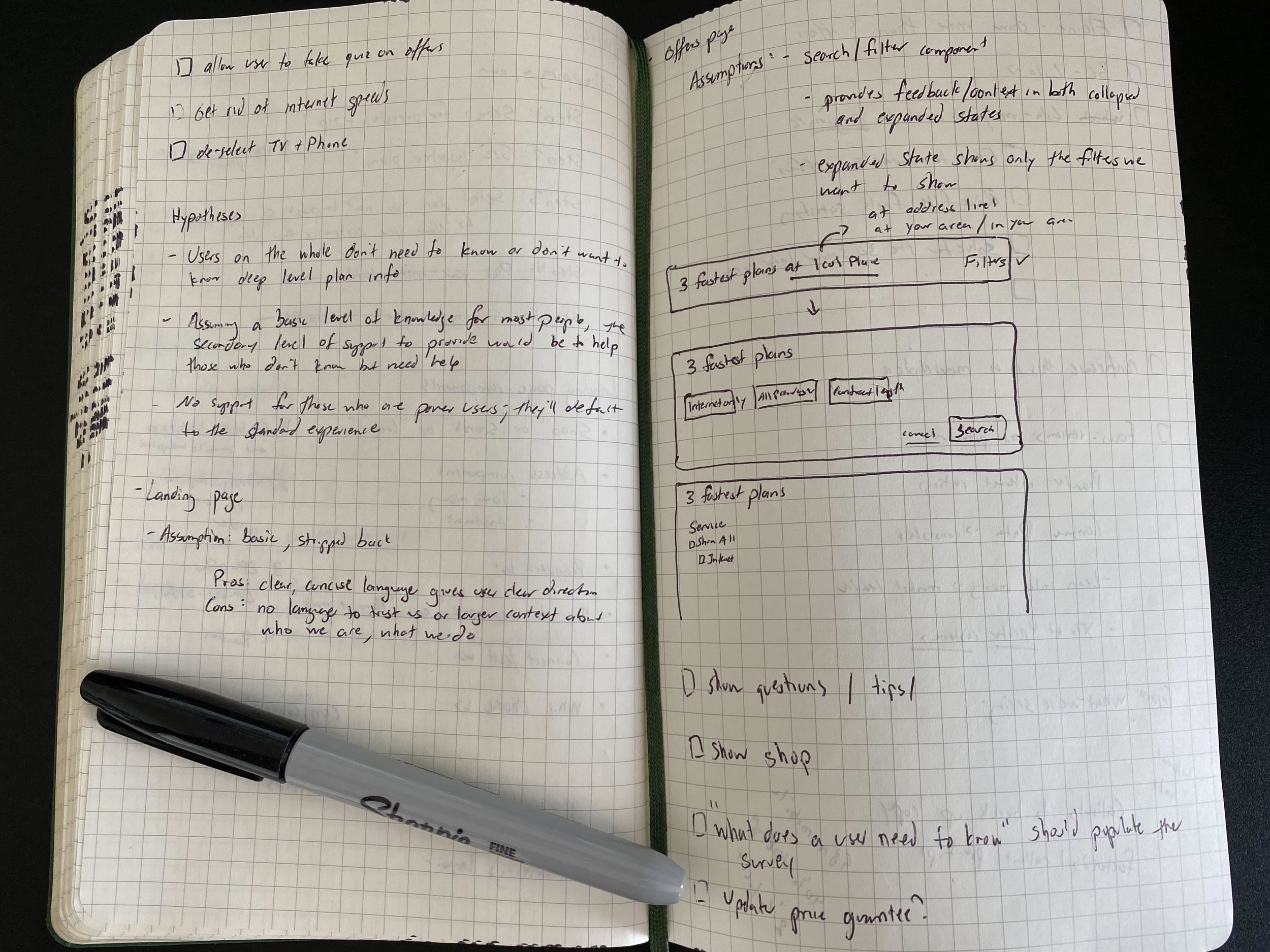
Exploration: I sketched out multiple flows in low fidelity before moving up and taking on our design system as I increased fidelity.
Iteration
Experimentation: Updater has a robust data and testing methodology. This project had incorporated years’ worth of iterative feature testing which helped us incorporate best practices we had discovered along the way. Those fed into early mock ups that we user tested with multiple cross functional Updater employees as well as user testers.
Feedback: I collected feedback from multiple sources to push the design forward with each round.
Iteration: I collaborated with my product, design, and engineering teams to ensure that the MVP evolved with each round of feedback yet retain the vital components. I also worked with external business partners, which included their business, legal, and finance teams providing feedback.
Implementation
Learn through launch: We launched in Q4 2020 and obsessively tracked our quantitative metrics through Optimizely and our qualitative metrics through Fullstory. We reached out to users who experienced our flow to gather their feedback to improve our experience.
The Challenge
problem space
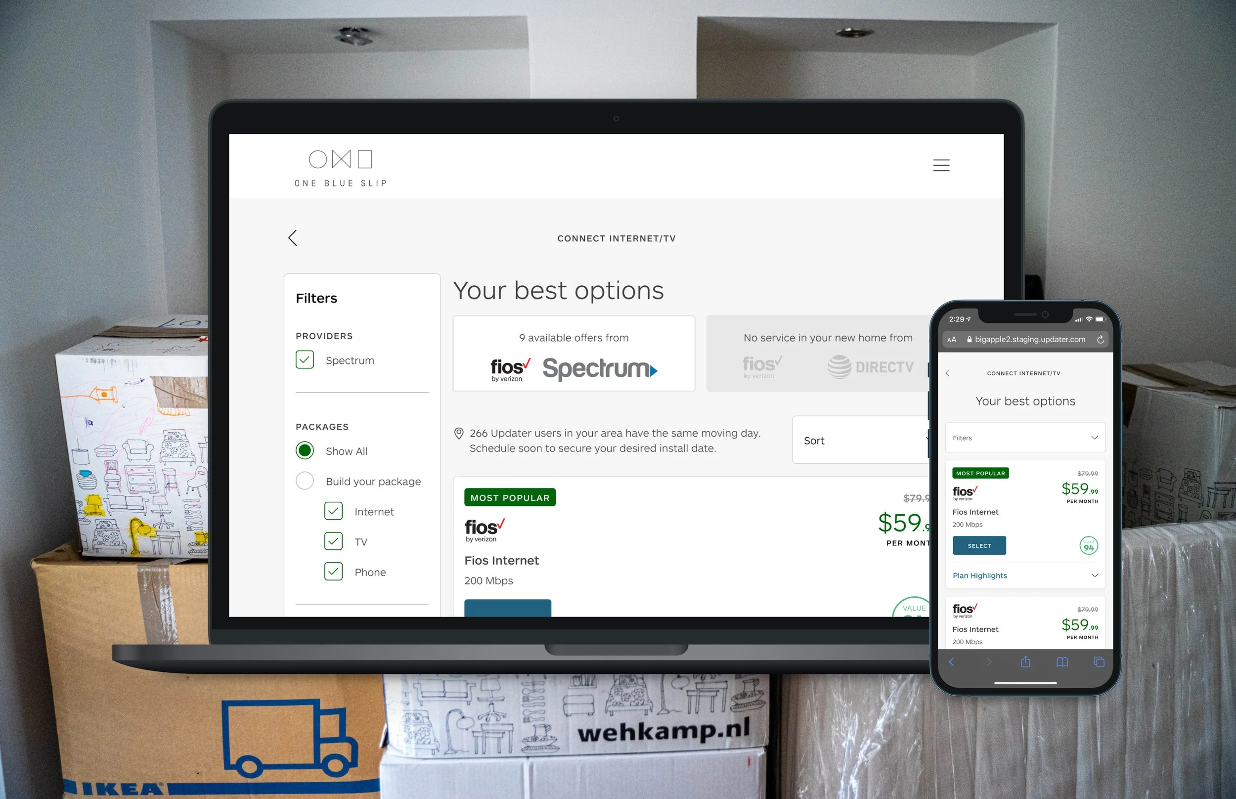
Historically, the main way to purchase internet has been going directly to a provider’s website or calling someone on the phone. The issue here is figuring out which providers are available at your address. Updater has thankfully solved the first part with our data and partner integrations so we share the available providers with them in their dashboard. This way we save them time by focusing their research only on available providers.
Through qualitative research, I found that users felt overwhelmed when sifting through all available Internet plans. I also found that users have a strong negative perception about both Internet service providers as well as their associated checkout flows. Consistently, I’ve heard that users find the process long, confusing, and overwhelming with the amount of information they have to process.
updater opportunity
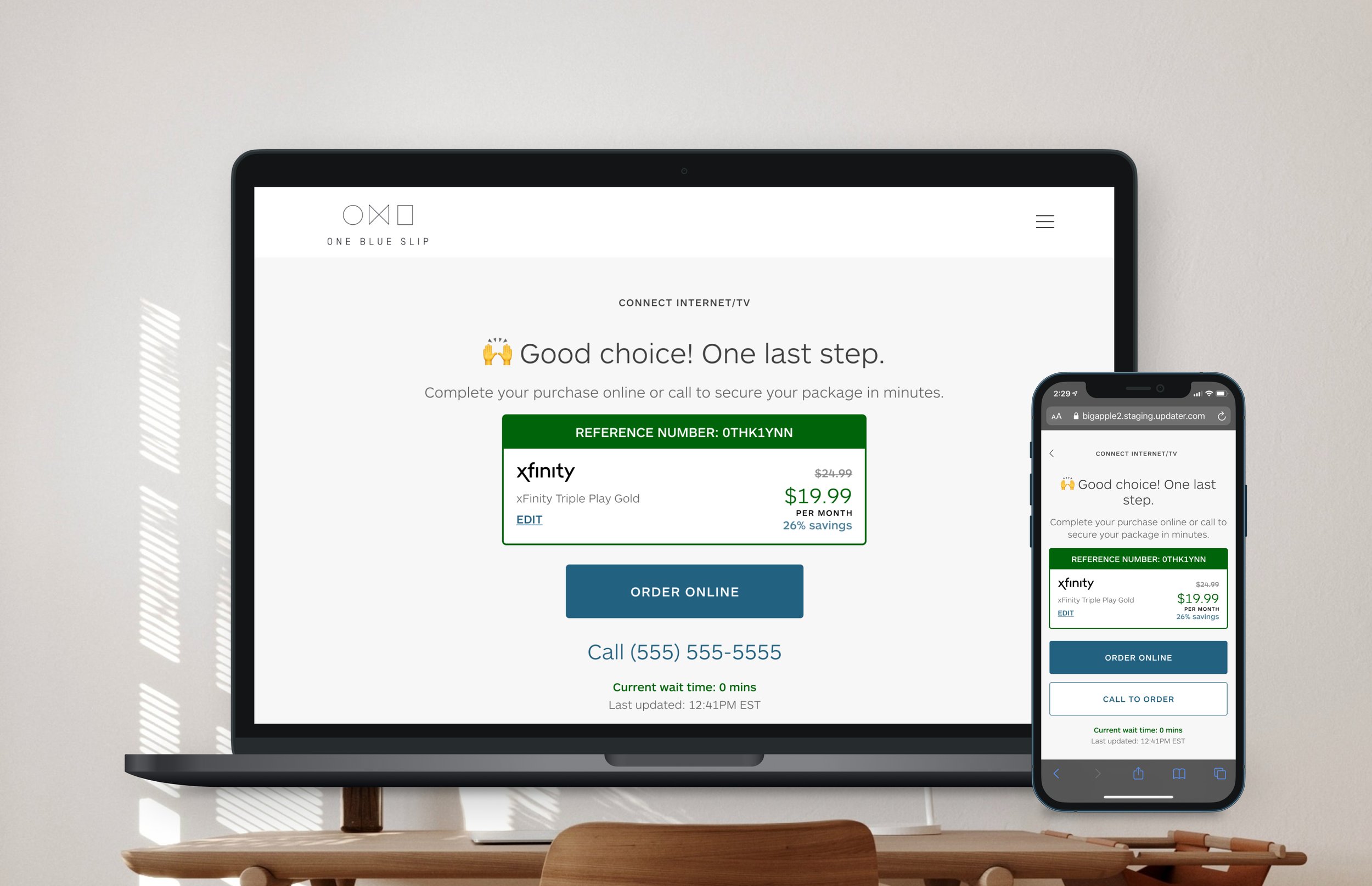
The big opportunity here for Updater was to provide an ability to purchase TV/Internet plans directly through us. We could be able to simplify the purchase process and present it in a conversational way. Also, Updater’s legacy purchase experience for TV/Internet plans was through our call centers, which had about a ~7% conversion rate. With an understanding of the problem space and user reviews in tow, the two main objectives I had were:
1. Provide a stable check out experience that successfully processes orders
2. Improve our conversion rate
THE VISION
Early on, it was clear that our the API documentation would limit what I could do. I also needed to see what I could replace, reorder, and rewrite to make the process seem friendlier and clearer to our users. I created feature flows that captured critical data for each step. I also needed to ensure that I didn’t negatively affect our current checkout capability when we launched this feature.
THE HYPOTHESES
Based on the research and other feature testing we did, I set out to track two hypotheses:
Hypothesis 1: Users want to answer one question at a time vs. many questions on a single page
I had gotten signal that users were making their way through flows faster if I only asked one question per page rather than multiple questions on a single page. I wanted to apply that here because this would address users’ concerns of feeling overwhelmed when purchasing Internet/TV plans through provider partners’ websites.
Hypothesis 2: Users appreciate smart, pre-selected options when asked to make a choice
I had an idea that pre-selected options instead of those that were empty that forced users to select one also did better. These “smart pre-selects” would hopefully help address users’ feelings of confusion.
Wireframing and Initial Design
I created and iterated on the initial wireframes which were tested relentlessly to determine which aspects held water and which would find themselves on the cutting room floor.

THE FINAL DESIGN
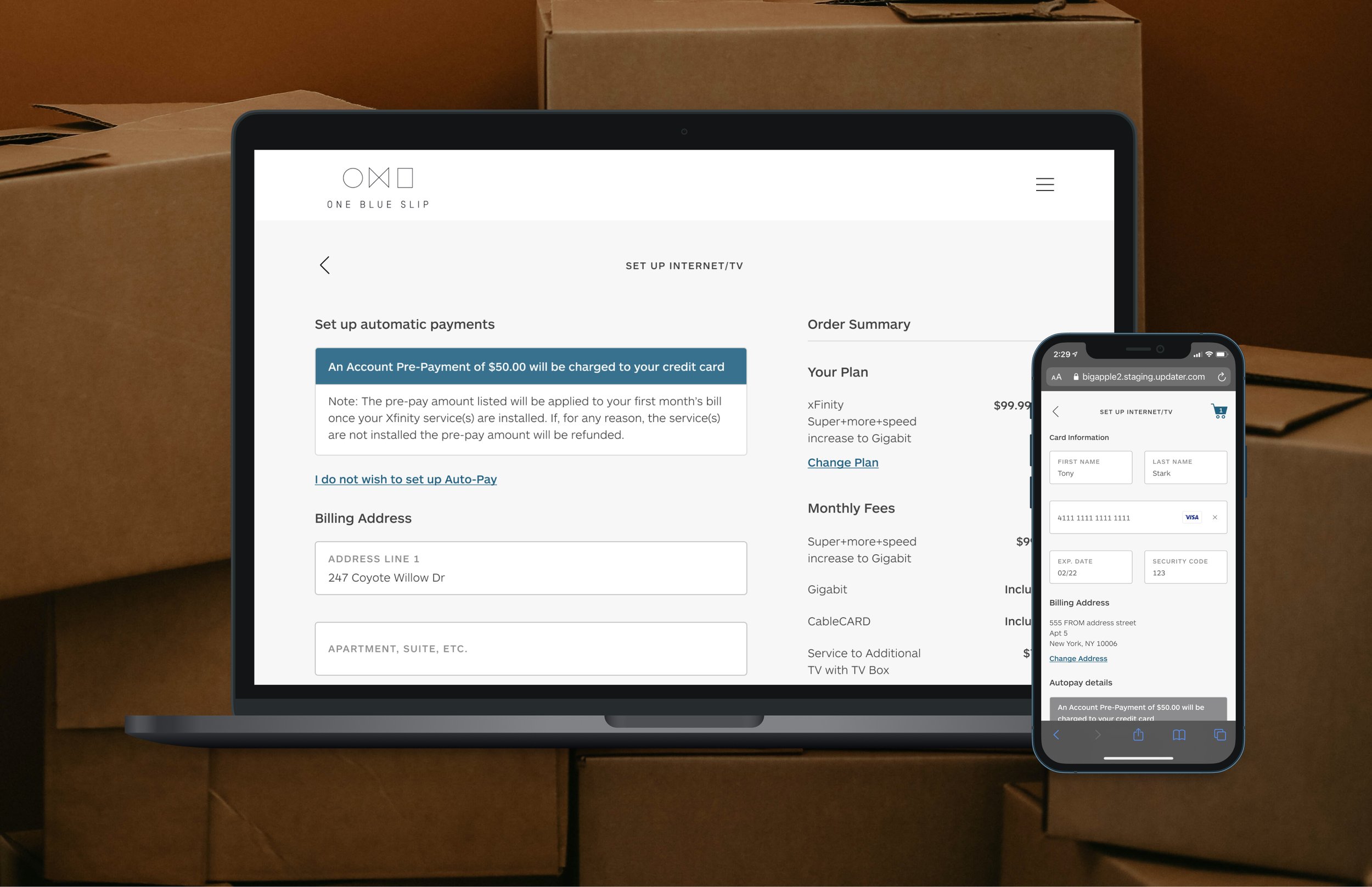
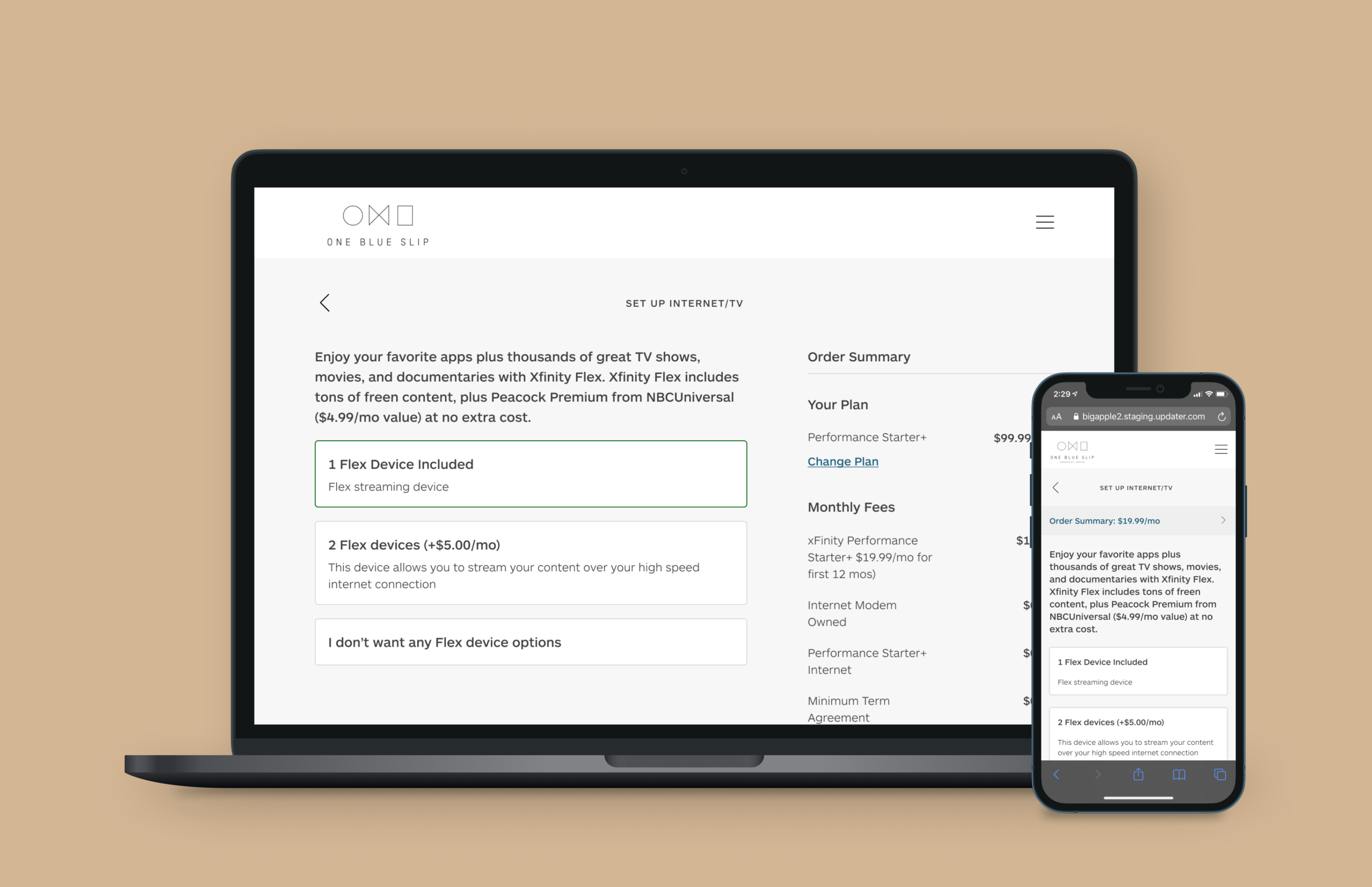
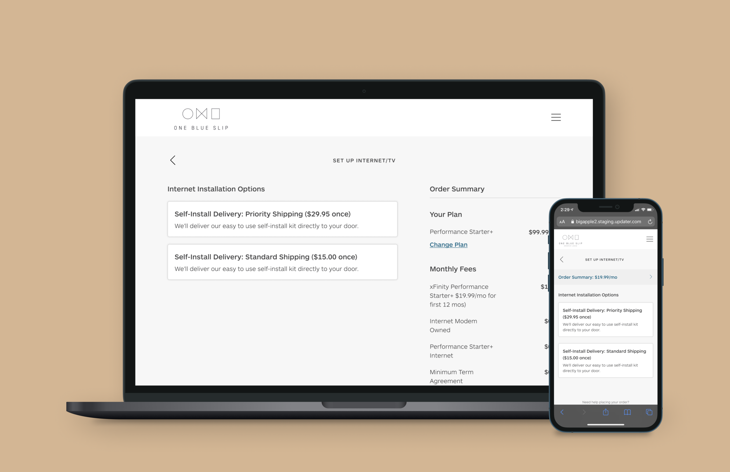
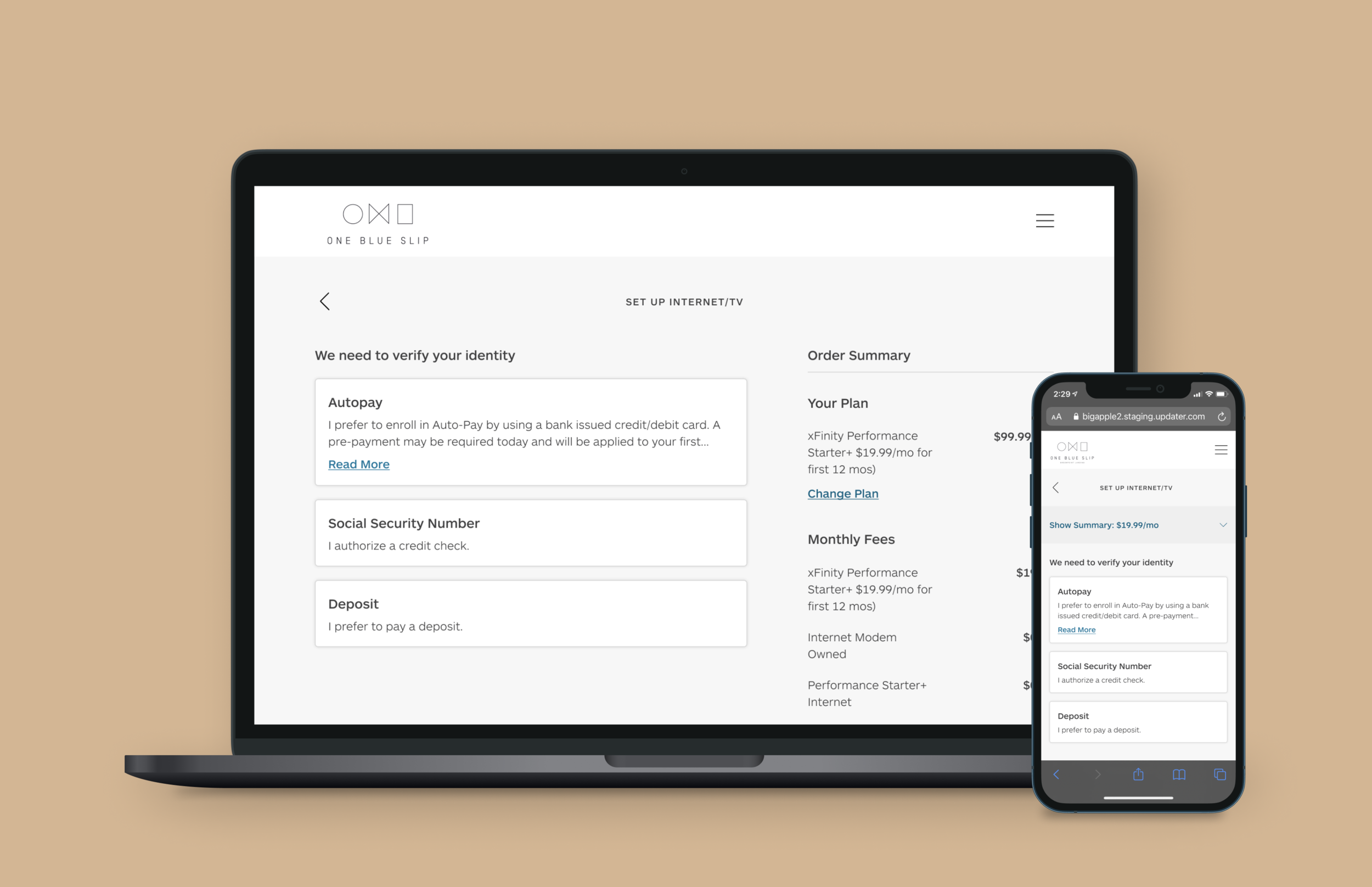
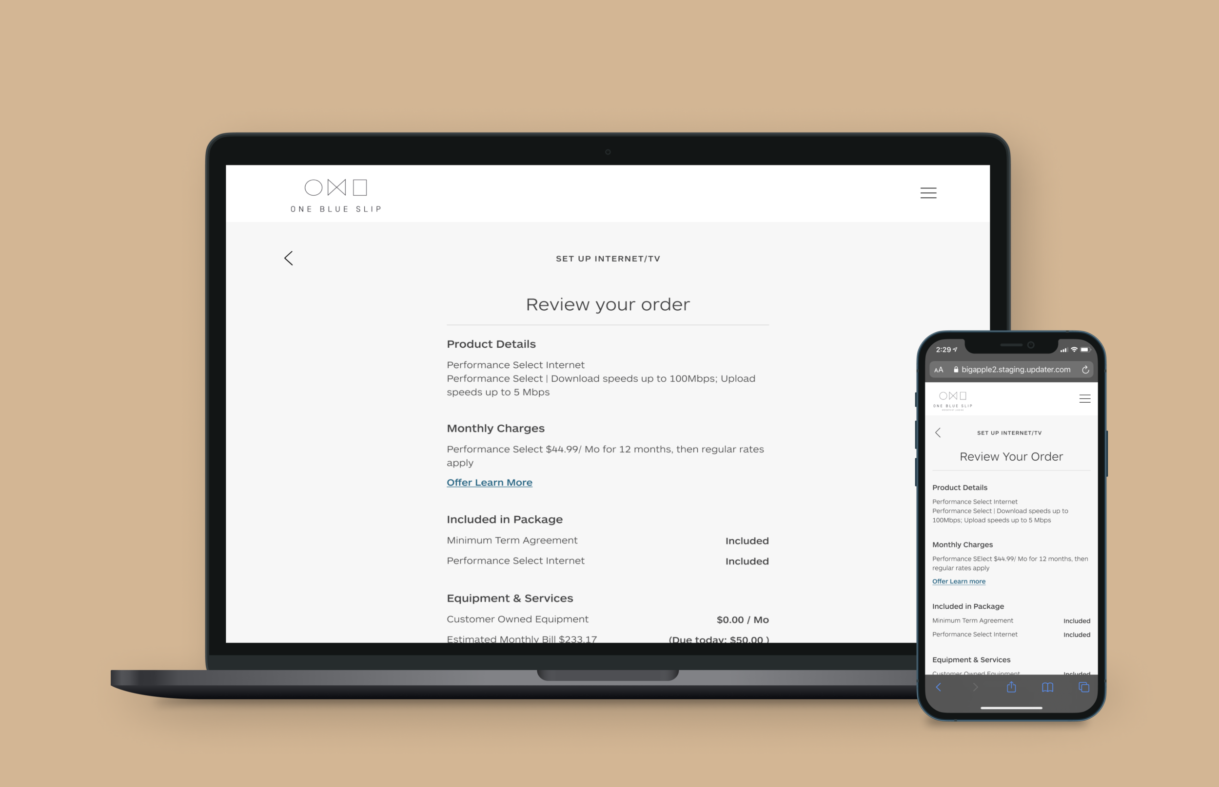
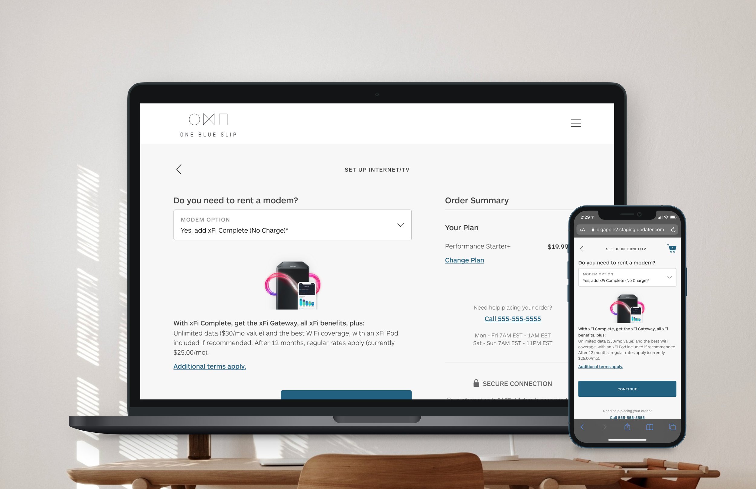
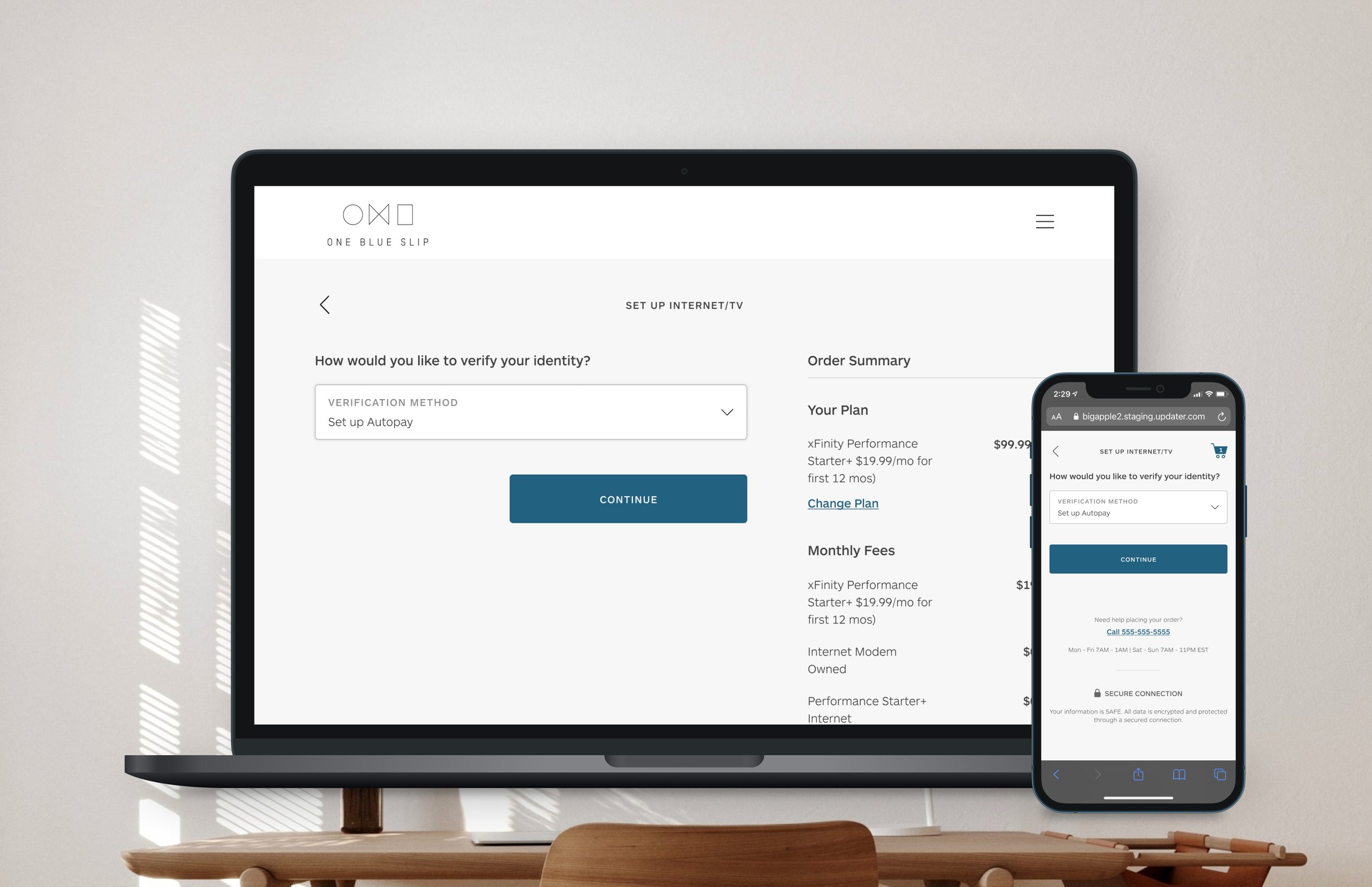
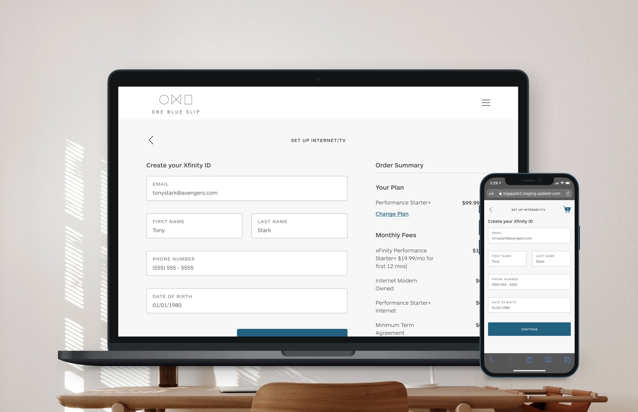
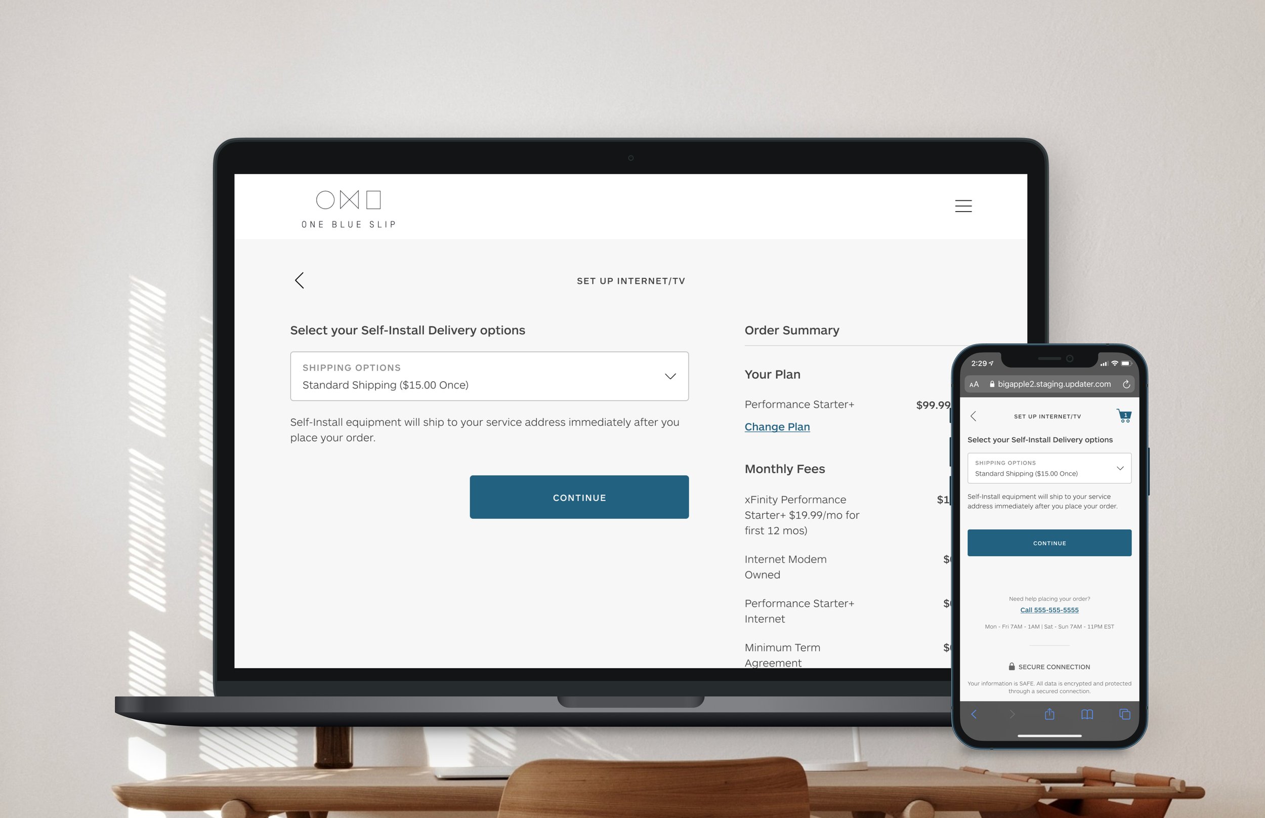
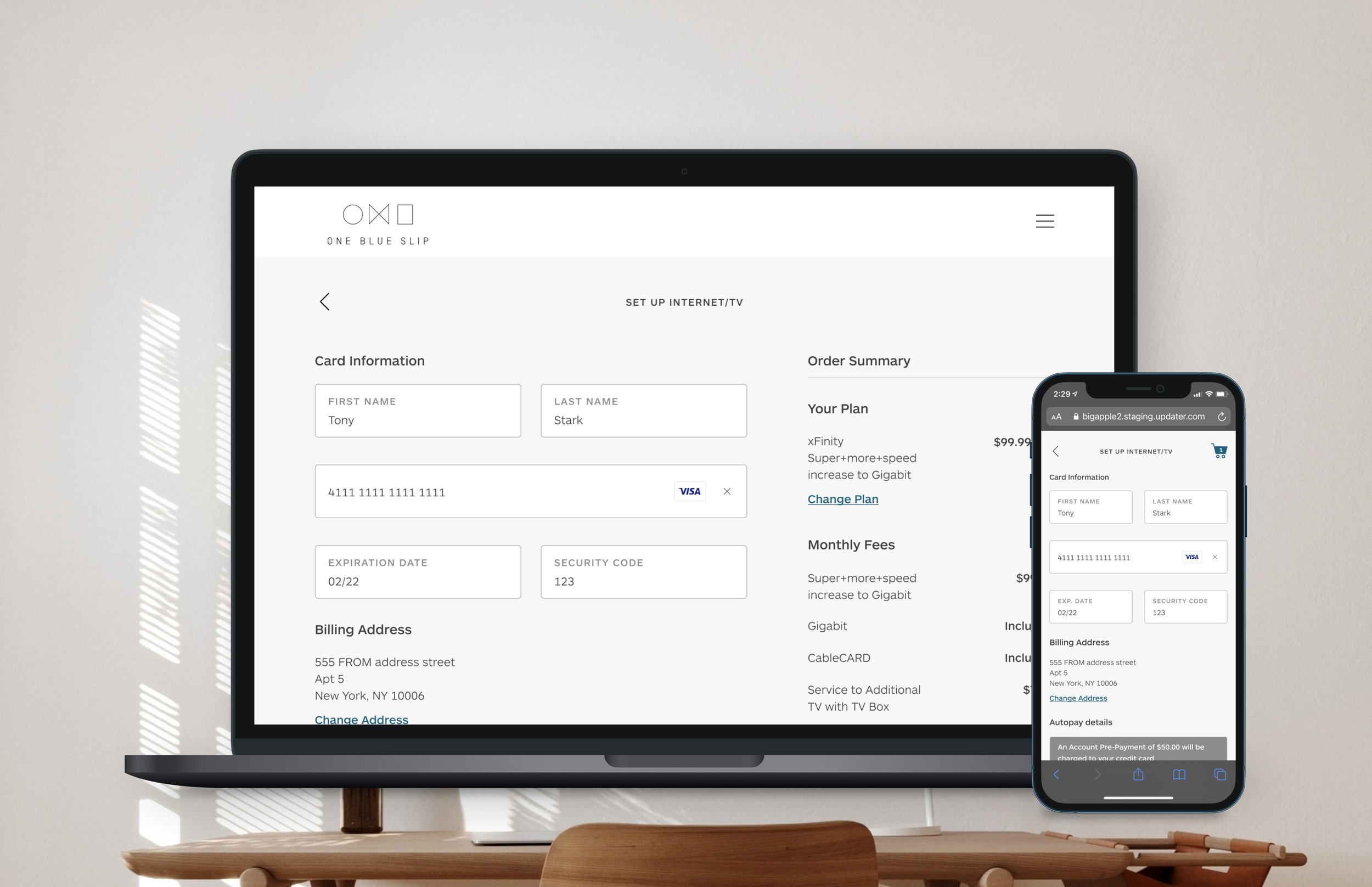
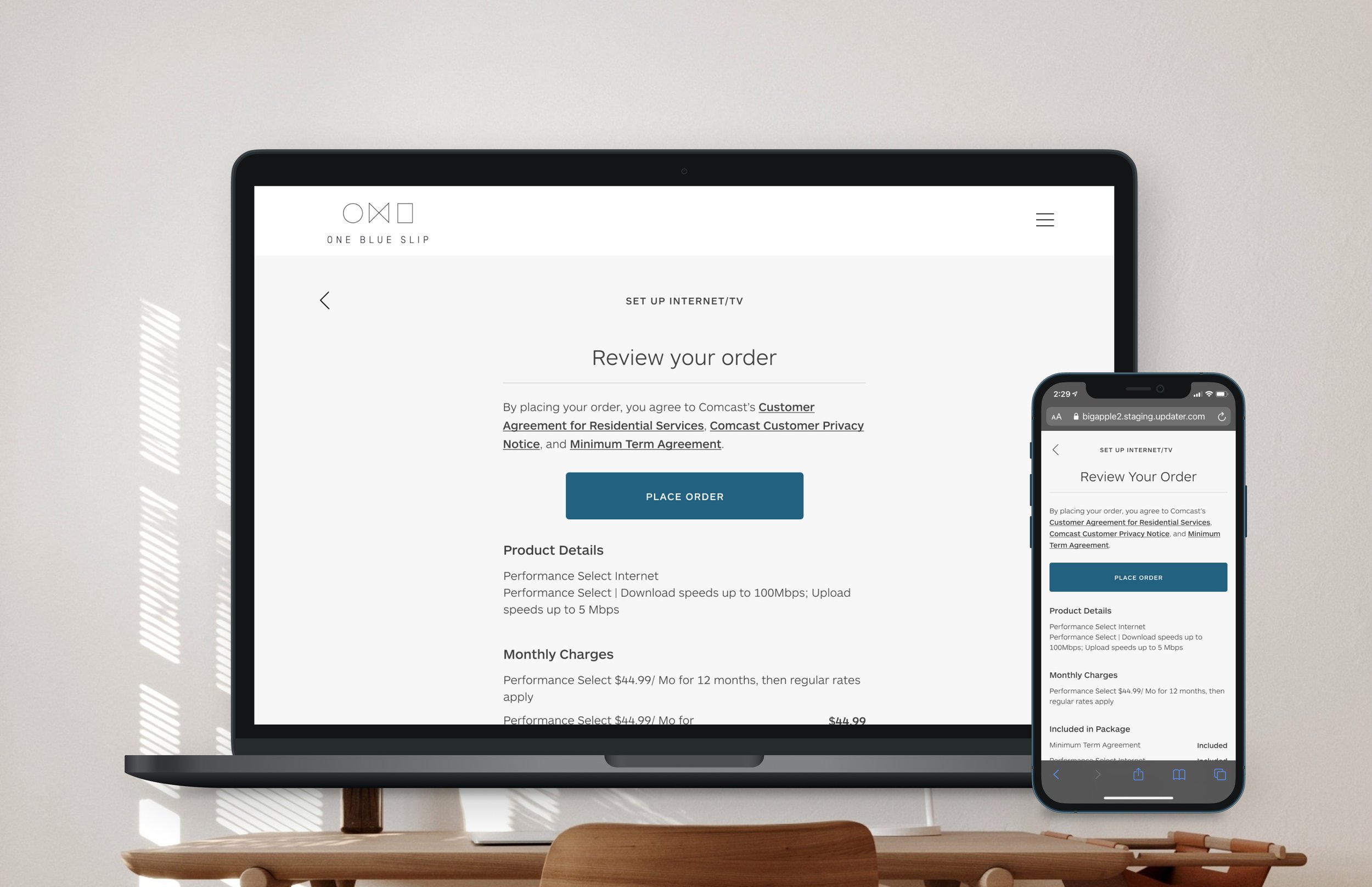
After much iteration and testing, I found that I had to keep making it simpler and simpler, both with the components I was using as well as the amount of text I was using. This resulted in a constant balance between how colloquial I wanted to be with what our provider partners’ required from a legal and business side of things. I also realized that by pre-selecting certain API forced steps and then hiding them from the user, I could further simplify the flow. This way, I could reduce the flow from over 10 steps to 5 steps. The number of steps is variable due to people’s credit worthiness and whether additional financing/deposits have to be paid.
Some big design changes I did was moving away from showing multiple buttons and going with a dropdown and a CTA. This way, I pre-select the most popular option on each step, hopefully reducing steps for the greatest number of users in the flow. In addition, I optimized the review order page to move the main CTA above the fold. I also condensed a couple hundred words’ worth of terms and conditions into hyperlinks that I pre-selected for users. This way, I reduced the number of actions before conversion.
THE RESULTS
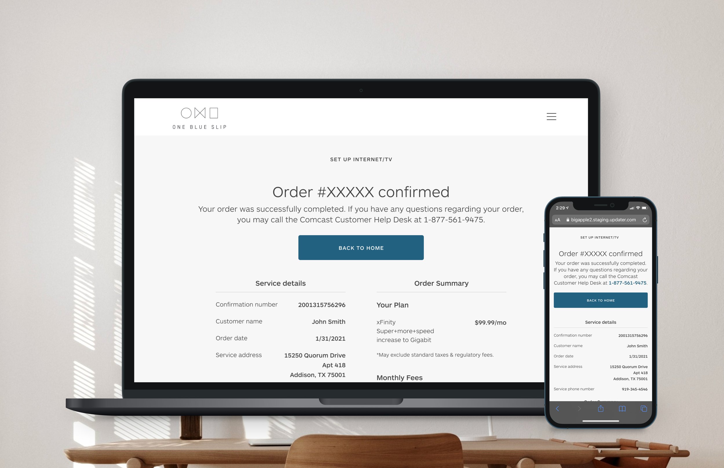
After launching it for a single provider, we found immensely positive results. We saw a 50% increase in engaged-to-conversion rate. From a revenue perspective, we saw a 46% increase in bookings. The basket size did decrease compared to our call center orders due to the call centers’ awesome ability to up-sell add-ons.
In addition to the improved business results, I got strong signals about our two hypotheses:
Hypothesis 1: Users want to answer one question at a time vs. many questions on a single page
Based on the increase in engaged-to-conversion rate, I was able to deduce that this user behavior was consistent across feature. This ended up being a standard design practice for all Updater features.
Hypothesis 2: Users appreciate smart, pre-selected options when asked to make a choice
While the increase in both bookings and engaged-to-conversion rate sold this, I realized that this paradigm could only be applied on a case-by-case scenario. So while it worked for this particular project, I explored other strategies to further improve step conversions.
THE TAKEAWAYS
We saw great uptick in user sign ups and conversions which validated our approach. Originally planned fast follows included certain UI tweaks and flow optimizations to further simplify the flow. However, we found that our provider API increased load times significantly. Some pages took over 15 seconds to load which was unacceptable. So we re prioritized all our engineering efforts towards improving load times.
That said, not only was Updater happy with the results, but our provider partner saw this as a validated approach to actually sell their products digitally on a third party website. Not only that, this forced them to improve their API offering.