American Express Platinum chat app
In a prelude to the flagship American Express Platinum App launch, a mobile prototype was built to connect Platinum Card Members with their Concierge service. A large user group consisting of both internal employees and “friends and family” was invited to test two major targets: the technology behind the prototype, and whether there was a real user need for easy Concierge service access.
In order to comply with my non-disclosure agreement, I have not included any proprietary information or research data in this case study.
My responsibilities
I was the day-to-day UX designer of the prototype under a lead UX architect. The prototype was only designed for iOS. We tackled ideation, implementation, and testing of the prototype in 100 days.
Ideation
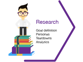
Research: I worked alongside the core team, along with business and research teams, to balance both the business goals and the user goals.
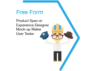
Experience Strategy: I worked with 1 product manager, 1 lead UX designer, 1 UI designer, and 1 engineer to distill features that anticipated and addressed our user needs.
Scope and Deployment Strategy: I worked with the overall team to define the MVP feature set and employ an agile work flow at a company unaccustomed to that pace.

Iteration
Experimentation: I led active guerrilla testing schedules by getting out of the office as often as possible; I also worked closely with in-house research teams to maximize focus group and 1-on-1 user testing sessions.
Feedback: I collaborated with my design and engineering cohorts to manage build prioritization.
Iteration: I designed and wired relentlessly, using an air of ruthless pragmatism to shave all unnecessary pieces from the prototype.
Implementation
Learn through Launch: The launch and results that we gathered helped focus and prepare us for the flagship app that this prototype would eventually live in.
Changing Corporate Culture: With a directive from the CEO to launch in under 100 days, we not only showed that our group and work style was paramount to this aggressive success, but that it was necessary to work more iteratively across the company.
The challenge
Evolving the Ccncierge offering
The Concierge service was deemed the perfect opportunity to achieve the two aforementioned goals. The business goals that we needed to solve for were:
1. Increase awareness of the Concierge service offering to a larger group of users, and
2. increase the spend on their Platinum Card as a result of using the Concierge service
There was a directive from the CEO to build a Concierge Chat prototype in under 100 days. This mission was an opportunity for the group to create a prototype that would become a foundation for a later flagship app. This project doubled as a chance to change a corporate culture that desperately wanted to design and iterate faster and smarter.
Cardmember insights
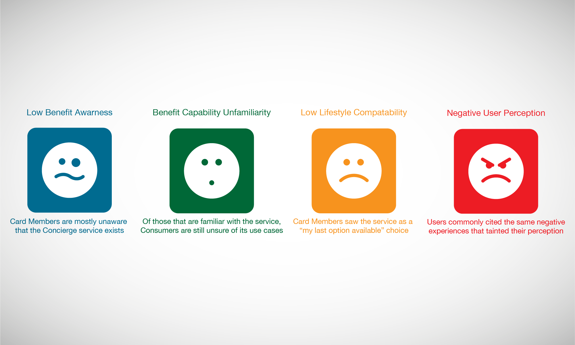
The vision
Early on, it was clear from Cardmember insights that Concierge was not only viewed as “an expensive service,” but also one that wasn’t compatible with their everyday lives. The vision of this prototype was to build a portal that would deliver a customized and tailored Concierge service to the Cardmembers, and make it easier than ever to connect to them. By focusing on these objectives, we would be able to accomplish:
1. Establish an easy-to-connect offering to make a 24/7 offering even easier to access
2. Increase Card Members’ spend by providing them with more concierge-booked experiences
3. Increase consumer views of the service as a whole, promoting repeat user interactions
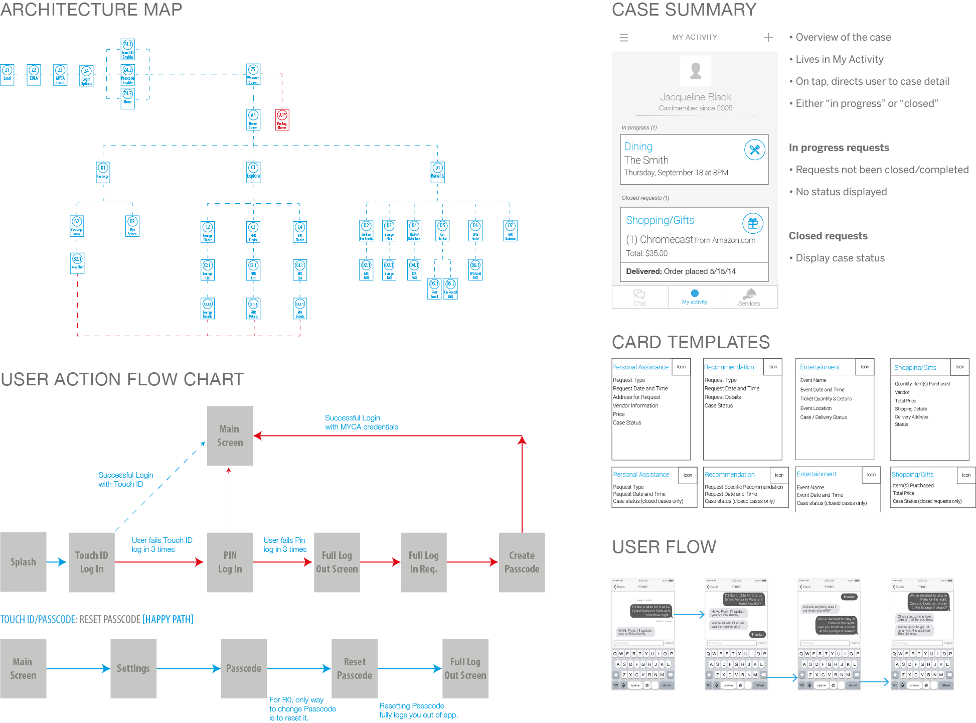
Wireframing and initial design
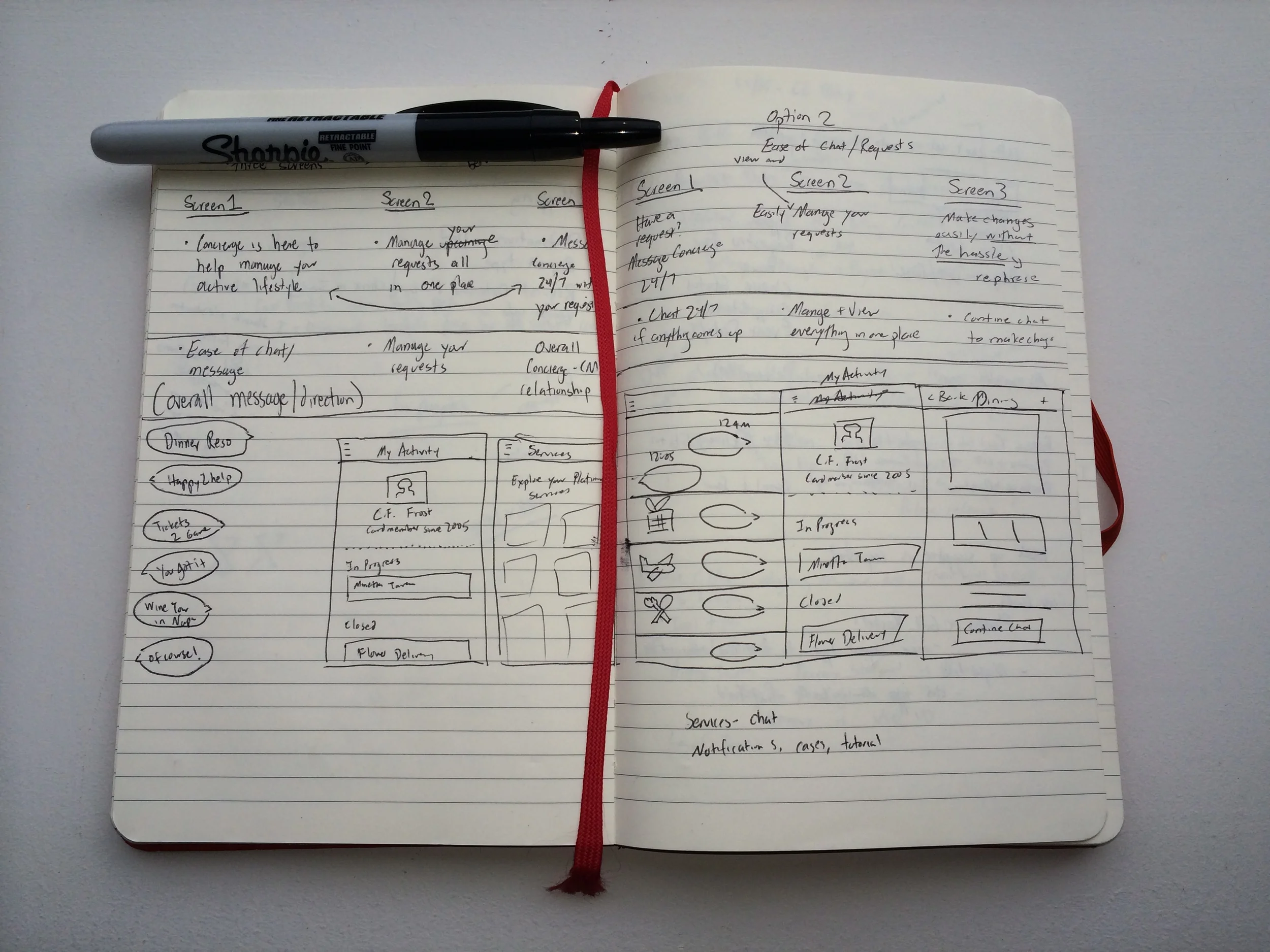
I created an architecture map, user flow charts, and templates to fit into our overall wires as we iterated on different types of layouts.
The final design
After much iteration, we found that a three tabbed approach was the easiest to convey the main functionalities in the app: Messages, My Activity, and Services.
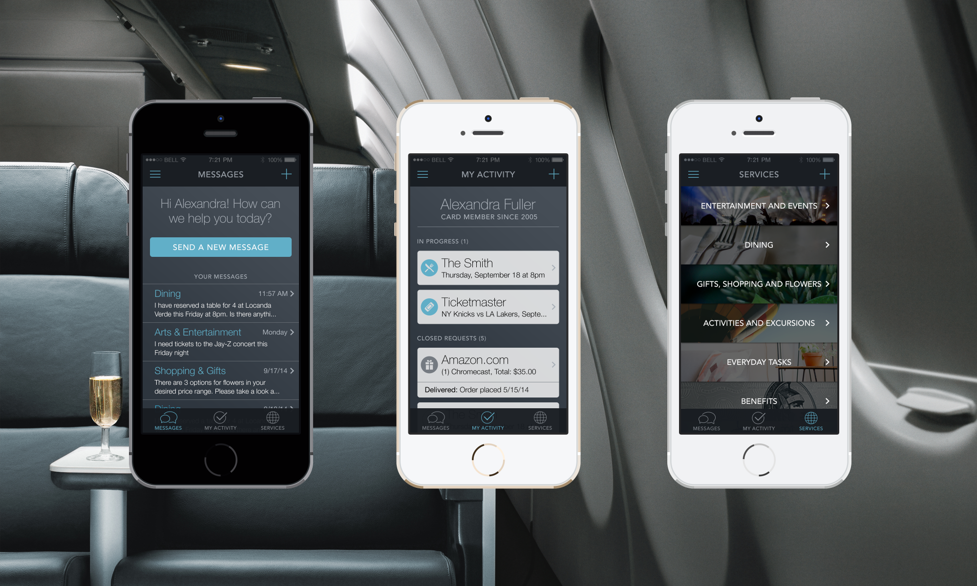
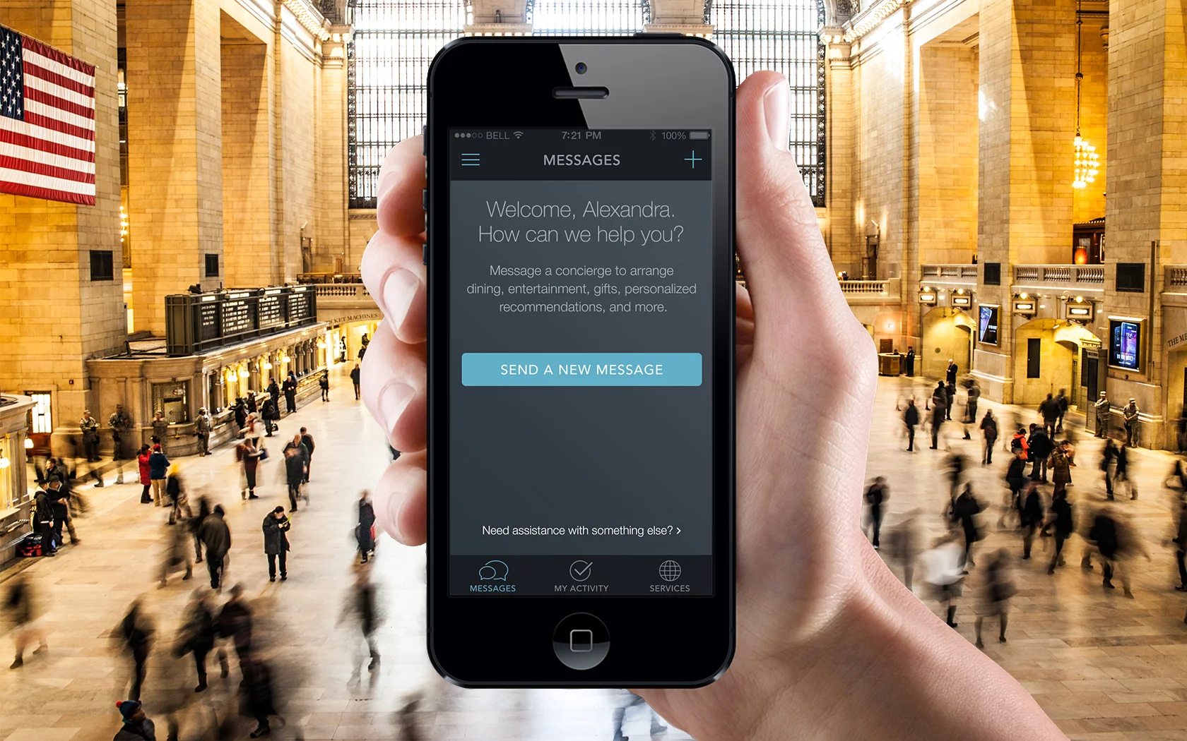
Messages tab
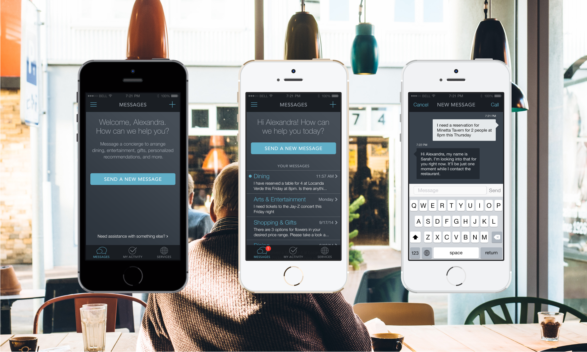
Messages would act as the main chat portal, giving users an inbox to all of their chats with the Concierge. From a first use stance, we’d offer a light educational moment by introducing the breadth of requests they could ask for. We also felt like a consistent “new message” action in the top right would be logical, giving the user an easy portal to connect with Concierge at any moment.
My activity
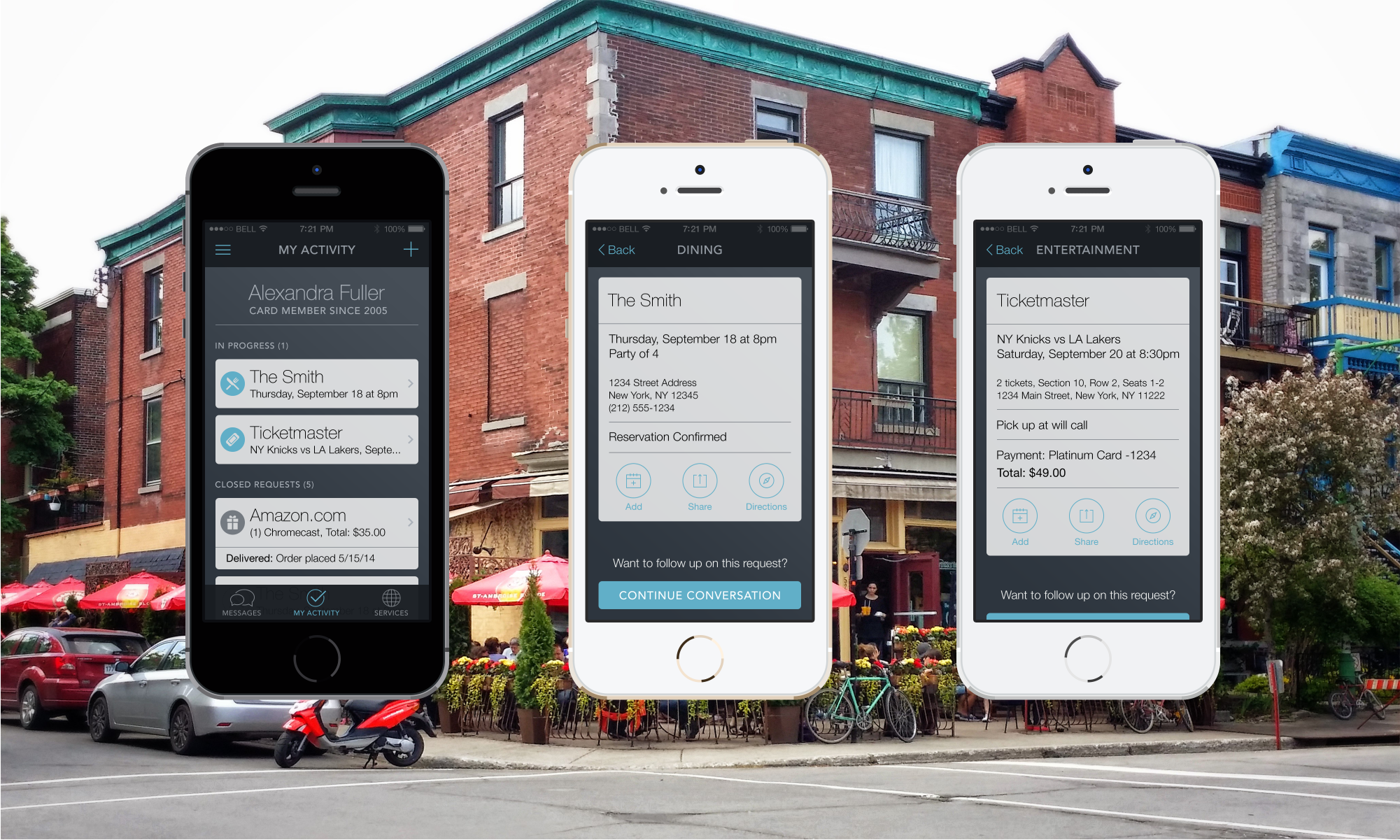
My Activity would house their upcoming requests. Card Member requests were tracked in a card structure, giving the user a high level preview of their upcoming requests. The cards would be easily identifiable based on an associated icon, with easy to digest information for the user to breeze through.
Services
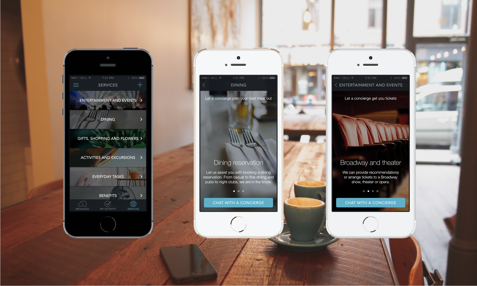
We wanted to battle low benefit awareness levels by showing a breadth and depth of all the potential requests a Card Member could ask Concierges. We presented the option to chat as the main CTA in each “subject” section to make it very easy to connect with available concierges.
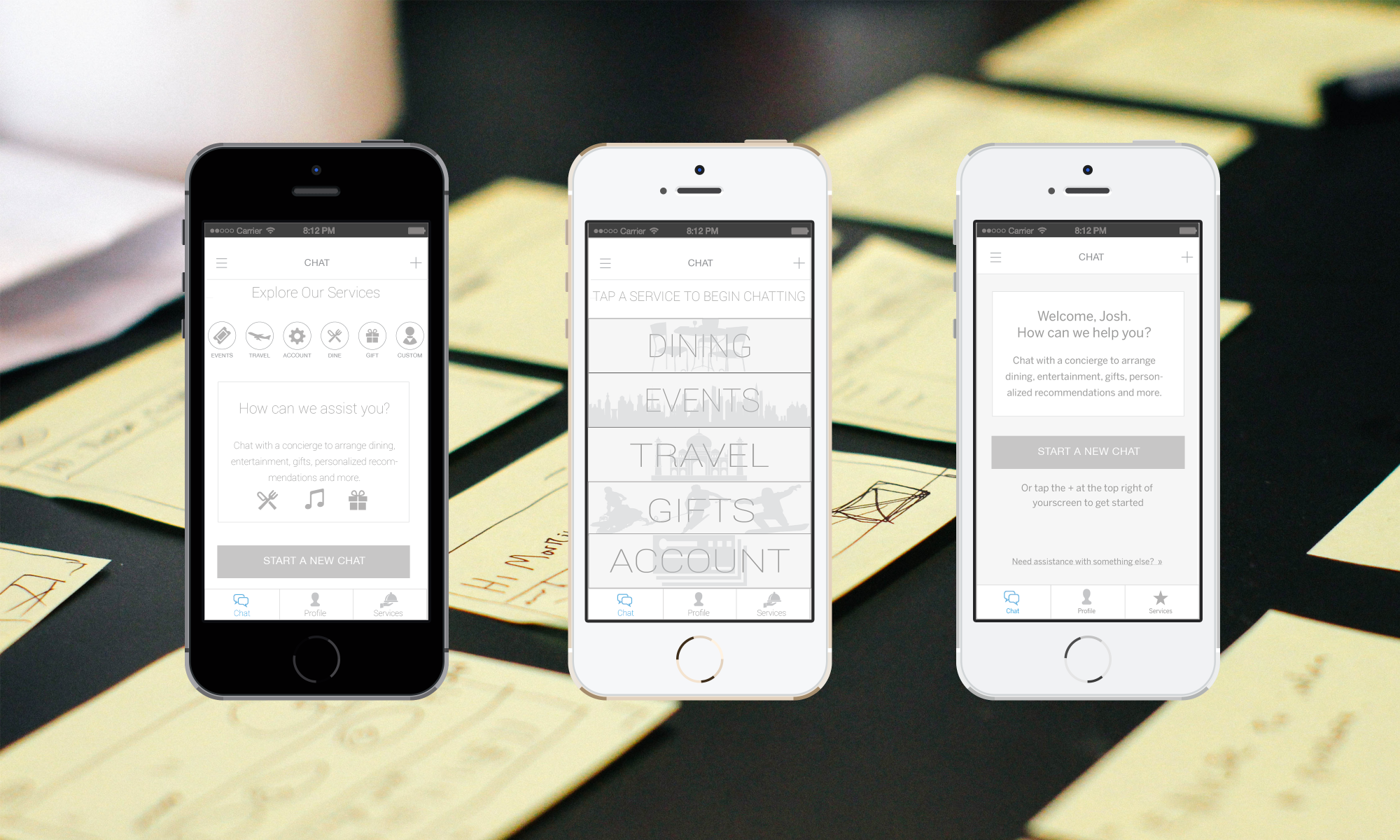
Version B
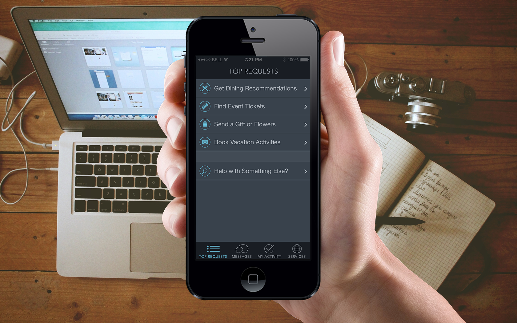
The main difference with Version B was to create a new tab that would push the “Top Requests” to the user, to immediately help them with their requests. We listed them in order of previous request volume.
The testing
Card members were sent an email with a survey, helping to cull users who fit the technical criteria of our prototype build. Around 300 users signed up for the beta which ran for 30 days.
There were 2 main hypotheses we tested:
1. Users prefer “free form, continuous” chat over “Categories driven chat”
The group was split on how we thought Card Members would engage with our Concierges. Some thought that a simple, open form to allow users to create an organic conversation would work. Others thought that initial prompts guiding the user as to which topics they could get help in (Dinner Reservations, or Broadway Tickets) would help direct the user more effectively.
2. Users want a “receipt” of their reservations in the app
There was also a healthy debate over whether there should be small receipt cards in the app to track user reservations and bookings. Some thought that it would be beneficial for the user to have a list of active requests that were easily accessible in the app. Others thought that tracking the conversation would be the more user friendly option, with confirmations sent to the user in email form.
This led to two version of the prototype being developed. We split the overall group of user testers into those that would see free form chat, and those that would see a categories driven chat. With regards to the “receipt” functionality, we decided that everyone should receive this. The main trick to this aspect of the prototype was to train the Concierges to adopt this behavior.
The results
In 30 days, almost 500 requests were made by our user group. There was an initial surge of downloads of the app, which leveled off for the remainder of the testing period. Users remained very active throughout the pilot. over 70% of chats were resumed chats, with the average user having 7 distinct conversations with Concierges. What did we learn about our two hypotheses:
Hypothesis 1: Users prefer “free form, continuous chat” over “Categories driven chat”
In Version A we found that over 65% of all messages were initiated with a free form chat form, with push notifications coming in around 30%. The remainder was split between the Activity tab and the Services tab.
In Version B, we still found that a majority of users started their conversations from the Messages tab. Push notifications represented around a quarter, with the “Top Requests” tab generating less traffic than we thought it would.
Hypothesis 2: Users want a “receipt” of their reservations in the app
Through qualitative testing, we found out that most users didn’t mind having their “receipts” cards in the app, but referred to their email confirmations more often. While we did see a good amount of chats get resumed from the “receipts” cards, users found it easier to continue their conversations in the Messages
Concierges were overwhelmingly successful in completing Card Member requests, with a success rate over 75%. Concierges were able to respond promptly and users felt that it was just as, if not more, effective than speaking with Concierges on the phone.
The takeaways
There were some areas that needed improvement. We found out that the Concierges were too verbose when chatting with Users, who asked that responses from the Concierges be a bit shorter. Also, email confirmations weren’t always sent to the User, which would require the Card Member to reach out again to the Concierge to have them resend. There’s also the instance where the User reaches out with a request, but the Concierge can’t fulfill it and thus results in a failure moment. This remains a constant challenge as the business overall looks to improved the offering.
Overall, users were very happy with the prototype. They felt that it was a compelling tool to connect them to the Concierge offering. Users felt their awareness of the benefit increased substantially. What was also a major positive effect was the reduced call volume that we decreased to the Concierge desk. Since chats are cheaper from a cost standpoint compared to phone calls, this is a major win. By increasing the amount of Card Members who are satisfied with the benefit while reducing the cost associated with benefit utilization, we succeeded quite well with the prototype.